Street Source is shutting down April 30th, 2026. Read the announcement

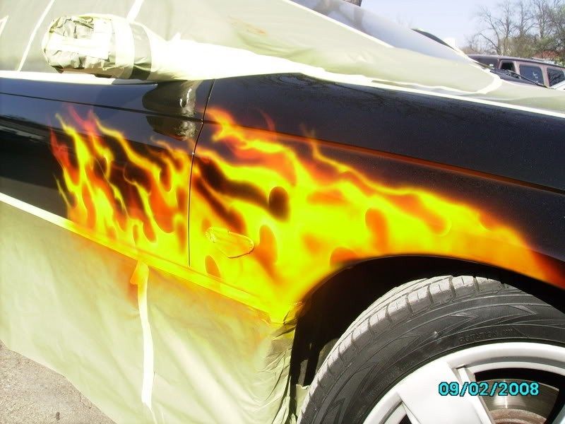
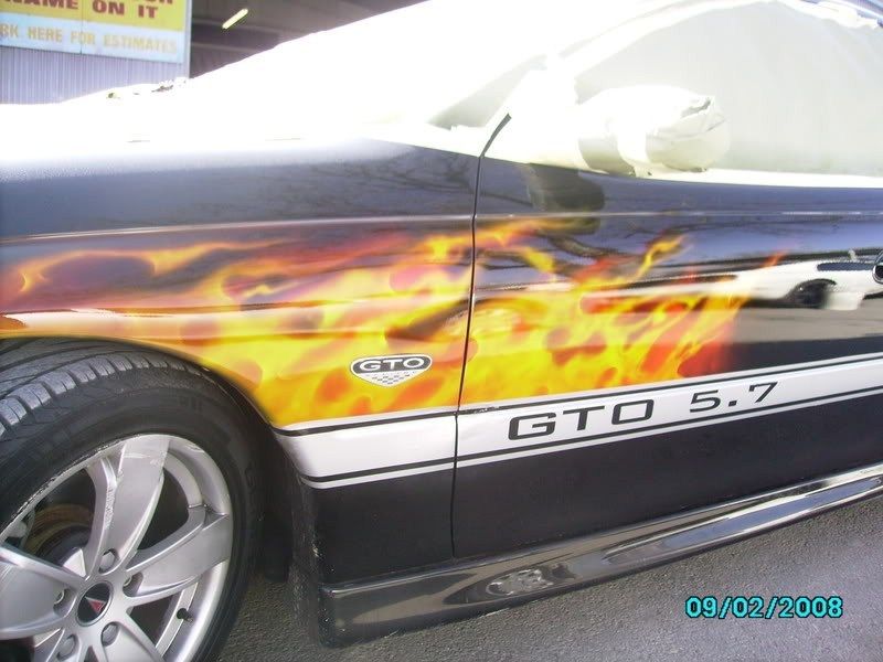
FIRE JOB

killerc10
+1y
CHECK OUT MY RECENT FLAME JOB TELL ME WHAT YOU THINK GOOD OR BAD
killerc10
+1y
killerc10
+1y

Dustins10
+1y
i think it should have been a little more do any on the hood?? but the fire looks really good nice work

LowXpectations91
+1y
i think there should be color on top of the yellow, doesn't look 3-d to me. or maybe even highlight with some white, but looks good. jus wanted to give my opinion

wileypdf
+1y
it certainly looks flaming..... hee hee I like it. Boone is right if you were going for the real look, a little bit of blue and a touch of white would have set it off but I personally really like how it looks especially how the existing racing stripe is used as a border

seanb
+1y
Looks good to me. I'd like to see maybe more 'layers' of fire behind the main ones but overall good interpretation.
killerc10
+1y
Originally posted by LowXpectations91
i think there should be color on top of the yellow, doesn't look 3-d to me. or maybe even highlight with some white, but looks good. jus wanted to give my opinion WELL FOR THIS ONE I WAS THINKING OF WHAT KIND OF FIRE FOR IT.IF YOU LIGHT DIFFERENT THINGS YOU GET DIFFERENT EFFECT COLORS. AND THIS ONE I WAS GOING FOR A BBQ PIT FIRE LOOK THATS WHY I DONT HAVE TO MUCH HIGH LIGHTS IN IT. I'M JUST A PYRO FREAK WHAT CAN I SAY!
i think there should be color on top of the yellow, doesn't look 3-d to me. or maybe even highlight with some white, but looks good. jus wanted to give my opinion WELL FOR THIS ONE I WAS THINKING OF WHAT KIND OF FIRE FOR IT.IF YOU LIGHT DIFFERENT THINGS YOU GET DIFFERENT EFFECT COLORS. AND THIS ONE I WAS GOING FOR A BBQ PIT FIRE LOOK THATS WHY I DONT HAVE TO MUCH HIGH LIGHTS IN IT. I'M JUST A PYRO FREAK WHAT CAN I SAY!
C
CRUISER-CH!X
+1y
no bad! good job
killerc10
+1y
THANKS GUYS
Related Discussions in Body work and Paint
Thread
Posts
Last Post
4
G
last post by
gkc301 +1y
5

last post by
Bizzo +1y
0
R
last post by
Racer911 +1y