Street Source is shutting down April 30th, 2026. Read the announcement
New SS logo in the works

baha
+1y
Working on a new logo for Street Source, what are your thoughts? A main goal is to be bold and easy to read.
baha
+1y
Thoughts good or bad welcome!
baha
+1y
Another pic

guilty by design
+1y
kinda.... plain

mjavy7
+1y
humm...
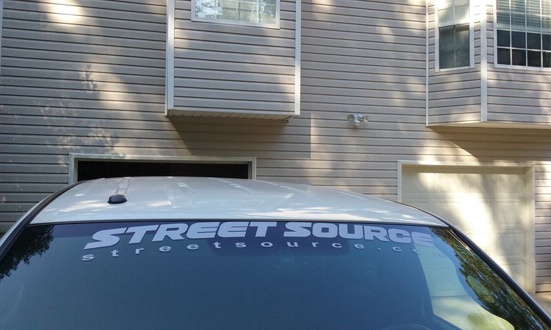
Could you place the ".com" after the the name on the top and only have one line?
If you have smaller ones (for side windows), I want two of them :-).
Could you place the ".com" after the the name on the top and only have one line?
If you have smaller ones (for side windows), I want two of them :-).
baha
+1y
Thank you for the feed back!
mjavy7, for your question, definitely! The first version of the logo is almost finished, I'm going to create a few additional variations to see what you think. Once the logo if finalized I'll create some different variations for stickers.
mjavy7, for your question, definitely! The first version of the logo is almost finished, I'm going to create a few additional variations to see what you think. Once the logo if finalized I'll create some different variations for stickers.

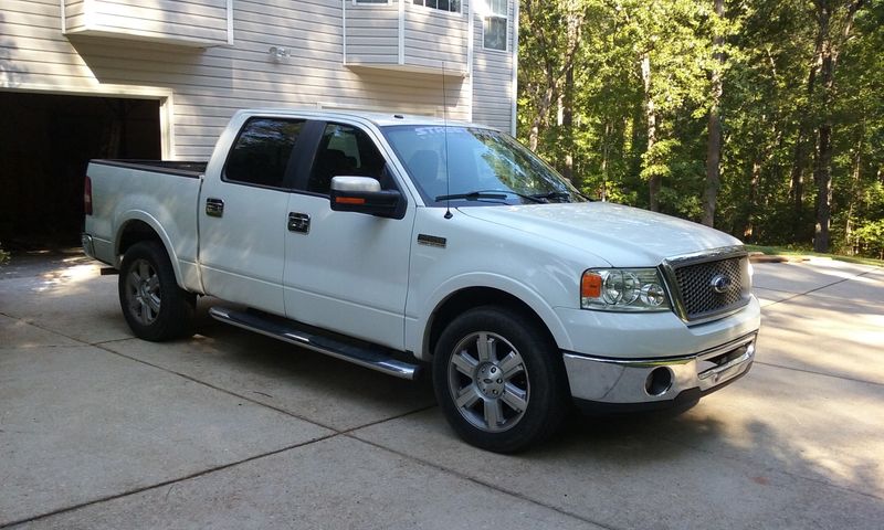
truck action
+1y
I don't think many people would sport the large style, the smaller ones like what you sent me yes & quite a lot of people have been taking stickers @ shows so hopefully they are checking the site out!!

22below
+1y
The original was great, where Street was in a different font right?
Have you come up with the final one?
Have you come up with the final one?
22below
+1y
I am pretty sure I have some original stickers I plan to rock on my Ranger when it makes it out to a show finally.
baha
+1y
Yeah I think they used the Chiller font for street in the original one. I should be able to get stickers cut with the old logo if you need a custom size once your Ranger is done. How's that project going, it has a S2000 motor in it right?
It took awhile but yeah I think the new logo is pretty much done, I need to upload a new photo!
It took awhile but yeah I think the new logo is pretty much done, I need to upload a new photo!
Related Discussions in Street Source Suggestions
Thread
Posts
Last Post