Street Source is shutting down April 30th, 2026. Read the announcement
...:::New Release From EKD - Kursed:::...
347 views
8 replies
9 following
...:::New Release From EKD - Kursed:::...

eyekandydesigns
+1y
Edited: 1/14/2007 11:10:35 PM by eyekandydesigns
Edited: 10/10/2006 1:11:33 PM by eyekandydesigns
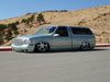
Here is one that should be deputing at SEMA...been under wraps for a little bit...front bumper was completely made in 3-d and imported in.
oh...and here is how I originally did the graphics but the owner wanted it like above...what do you guys think looks better?
-rj
Edited: 10/10/2006 1:11:33 PM by eyekandydesigns
Here is one that should be deputing at SEMA...been under wraps for a little bit...front bumper was completely made in 3-d and imported in.
oh...and here is how I originally did the graphics but the owner wanted it like above...what do you guys think looks better?
-rj

fatboysS1O
+1y
i like it where the flames start at the front fender and work there way back. overall is a good lookin truck though!

purplekush
+1y
the original looks alot betterthe big long yellow wavey line where theres no flames kinda stands outyou should put some orange above the yellow up front like u did out back over that wavey part and the back wheel in the front looks a little flat
bumper .. cowl.. and grills look really nice
bumper .. cowl.. and grills look really nice

no1lowr
+1y
i like it but i think you struggle a bit between vecor looking and realistic looking images, try and focus on a certain or like meduim.

CHOSN1
+1y
Original
M
MysteriousGT1
+1y
nice work, i like the scheme starting at the wheelwell much better

ShakinPlates
+1y
It looks really good. A few critical things a want to point out: The casting shawdow on the rims seems like it needs to be feathered out a lil bit. Also the front bumber looks out of line just a hair. I think its because the shadow between the fender and the bumper is off. Its something very small but the first thing I look for in peoples work is the angles... as you well know. LOL

TEEBAGGINNN
+1y
Light source is a bit off, the shadow on the wheels are too dark and at a different angle than the shadow below the rockers. The front bumper hangs below the rockers and looks too fake, try using the same light variances as the body panels with some reflections of the surroundings. Cowl on hood comes to too much of a point and needs to have more than one color on the side and top.
Rear bed corner is too round on side closest.
Mirror needs to be darker on the bottom.
Looks great, I usually do not look over renderings that well because I cannot do them.
Rear bed corner is too round on side closest.
Mirror needs to be darker on the bottom.
Looks great, I usually do not look over renderings that well because I cannot do them.

jrock74
+1y
like the second version better.
Related Discussions in Photoshop
Thread
Posts
Last Post

