Street Source is shutting down April 30th, 2026. Read the announcement

"graphics" keep or delete?

tiger
+1y
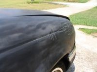
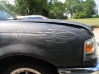
I've been throwing this idea around for a while. I used a silver Sharpie to test out what a simple pinstripe graphic might look like. Other then the base paint being uneven, the graphic being a little too big and uneven, I kinda like it. Thoughts?

msturg
+1y
I normally don't like graphics, but that's fairly simple and pretty clean, if you were to apply that to your two tone as a seperator it would look pretty good

scrp1day
+1y
i like it alot! looks really good. did you do them?
tiger
+1y
That's what I was thinking...like how I have it in my signature.
scrp1day-
Yeah, I've had that design laying around for like a year with this purpose in mind. I just freehanded it, the paint was really hot and made it hard to keep steady, lol. Not to mention I had to go over the line like 4 times, the silver just didn't want to cover.

bodydropped85
+1y
badass

spngr311
+1y
I like it, I think it looks pretty cool.
D
daweezi
+1y
KEEP IT
scrp1day
+1y
^ ditto it looks really good especially for a free hand with HOT paint!
D
drgitfgt
+1y
if used as a divider for the two-tone, it'd be bad...I generally don't really care too much for graphics and whatnot, but in a case like that it looks good. KEEP IT
Related Discussions in Ranger Projects
Thread
Posts
Last Post

